[Archive: 2013] Phosphorcracker's Entry

Phosphorcracker

New Adventurer
Joined
Nov 30, 2012
Messages
73
Reaction score
2
Location
Glorious Germany
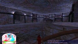
Hey guys, I may be a little late but atleast in germany the deadline isnt here yet. I made a little map, sadly i havnt thougth about a name for my map yet. It is my first attempt to map in any game and in my opinion it is not that bad. Feel free to comment and suggest things but keep a tone of manner.

I had no time to take fancy screenshots or clips i just can offer you my .rmf.

https://www.dropbox.com/s/9ijha4915eli7zd/lawl2.rmf here you go. fixed that strange leak.

https://www.dropbox.com/s/0txksilprkh9b ... flawl2.rar some screenshots.

Other informations:
I didnt use any prefabs in this map i made nearly everything myself except that Crystal model that one i got from Orichalcon as he intends to use this map in a sidequest. The map havnt got any monsters or transition zones as i simply dont know how to create them.

-Phosphorcracker
 

Thothie

Administrator
Staff member
Administrator
Moderator
MSC Archivist
Joined
Apr 8, 2005
Messages
16,342
Reaction score
326
Location
lost
Re: [Section 1] Phosphorcracker's Entry

Clearly we need to give out games more often - wtf have you mappers been hiding?

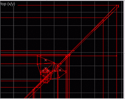
This is a nice little map. It's not lit, or I woulda compiled and screenshotted just to see what it looked like (although the obvious leak @ x 1664 y -104 woulda killed that too). Still, the structure and the style is pretty good.

Could use some expanding - although I suppose if you were lazy as f*ck, the way it's setup, you could just copy pasta and rotate it three times, then glue the bits together, for instant full scale map. ;)
 

Phosphorcracker

New Adventurer
Joined
Nov 30, 2012
Messages
73
Reaction score
2
Location
Glorious Germany
Re: [Section 1] Phosphorcracker's Entry

hmm last time i compiled there wasnt any leak and i didnt move anything gonna check that right away. anyway its not that iam lazy i just mapped a bit untill i didnt want to and now orichalcon convinced me to join the contest and i finished that map like today.

As i said i dont have any leak i can upload you a few screenshots.
Also if you accept my friend request in steam you can look at my screenshots there.

The hell is goin on there. I see that leak you mean there but as you can see i compiled the map like this without getting any error and i took the screenshots with this leak what doesnt count as leak...
 

Thothie

Administrator
Staff member
Administrator
Moderator
MSC Archivist
Joined
Apr 8, 2005
Messages
16,342
Reaction score
326
Location
lost
Re: [Section 1] Phosphorcracker's Entry

Weird, yeah, it's definitely there... The compiler's snap to might be compensating for it, as, despite its visibility, I think it's less than a full unit, and at a right angle... Still odd. I'd fix it anyways. ;)

With some lighting and expansion, the map would definitely be a contendah though. It's pretty good.

edit (looks at screen shots): Oh, I guess you do have some lighting - just very well hidden! ;) (Plus I get this thing, as I do with so many others these days, where I have to ramp up the gamma or use auto-color correct to see the darn screenshots.)
 

zeus9860

Active Adventurer
The True Followers of the Lost
Crusaders
Blades of Urdual
Alpha Tester
Joined
Feb 28, 2008
Messages
2,581
Reaction score
37
Age
31
Location
lolwut
Re: [Section 1] Phosphorcracker's Entry

Nice map! Kinda like the looks of it, reminds me a bit of challs and umulak (haha). :oldshock:
 

Phosphorcracker

New Adventurer
Joined
Nov 30, 2012
Messages
73
Reaction score
2
Location
Glorious Germany
Re: [Section 1] Phosphorcracker's Entry

Thothie said:
Weird, yeah, it's definitely there... The compiler's snap to might be compensating for it, as, despite its visibility, I think it's less than a full unit, and at a right angle... Still odd. I'd fix it anyways. ;)

With some lighting and expansion, the map would definitely be a contendah though. It's pretty good.

edit (looks at screen shots): Oh, I guess you do have some lighting - just very well hidden! ;) (Plus I get this thing, as I do with so many others these days, where I have to ramp up the gamma or use auto-color correct to see the darn screenshots.)

well i have the problem that its good visible for me if the screen around isnt day bright xD i use the windows dia show where the background is deep blue and then i can see the screenshot properly.

also i fixed that leak.

and i wanted to hide the lights as the colour doesnt realy fit the rest of the textures but in some spots you cant oversee it i dont know what iam going to do there it is something i propably change after the contest. and the lights are pretty low as its a crypt and i didnt want to place bright light in a crypt wouldnt fit the theme in my opinion
 

MS:C community

Old Skool Apostle
Alpha Tester
Joined
Jul 7, 2011
Messages
504
Reaction score
109
Re: [Section 1] Phosphorcracker's Entry

When I looked at the pictures I actually said "wow" out loud but when I looked at the source I kind of had mixed feelings. That's a lot of non-entity pillars you have and I'm kind of wondering what the r_speeds in this map are. Can you please give an indication?

Visually the map is pretty good though, don't get me wrong.

Also there's an empty func_water, might want to fix that.
 

Thothie

Administrator
Staff member
Administrator
Moderator
MSC Archivist
Joined
Apr 8, 2005
Messages
16,342
Reaction score
326
Location
lost
Re: [Section 1] Phosphorcracker's Entry

Well, there's a lotta kinda sloppy splits, that'd probably be fatal on a more complicated map...

wow_sloptastic.gif

But on a map this simple, the FPS impact might not be *too* bad, though I can't get the r_speeds from here. Those little texture lights, shaped like little gems, are probably adding a lot of poly, but I suppose they have to be that shape to achieve that lighting effect - though maybe they could be simplified a bit (maybe use spike/pyramids) and illusionary'ied.

Still, aesthetically, it's pretty darn good. Shame there's not more of it. I think those off grid splits may kill my copy-pasta instant expansion idea though. ;)
 

Phosphorcracker

New Adventurer
Joined
Nov 30, 2012
Messages
73
Reaction score
2
Location
Glorious Germany
Re: [Section 1] Phosphorcracker's Entry

Well the r_speeds arent to bad except in the very first room. theyre about 1,2k in the first room and the rest of the map has like 500-700 wpoly. as i said this was my very first try of mapping with hammer and as you can see the first room and the first hallway are just terrible as i didnt knew it better... if you look at the rest of the map its more properly and clean. also i dont had to care to much for performance and could add those brush pillars if i make that map bigger some time i'll have to fix it. Regarding the func_water that is empty i cant remember how to fix that.

These offgrid splits you mentioned Thothie theyre only there in this hallway with an arch as ceiling and i can tell you it was hell getting it to valid structures and then the cut on the edge wasnt the best solution to get rid of overlapping brushes if i had time i would have removed the complete ceiling there and would have used some other method less noobish.

Also thanks for the lot of positive feedback for the look. as my experience with hammer grows the beginner errors like offgrid splits and many other sh*t i produced out of lack of knowledge will be less and my maps more useable.
 

Thothie

Administrator
Staff member
Administrator
Moderator
MSC Archivist
Joined
Apr 8, 2005
Messages
16,342
Reaction score
326
Location
lost
Re: [Section 1] Phosphorcracker's Entry

Yeeeah... That'd be because you've been violating one of Gabe Newell's Ten Commandments, and mapping off the grid.

You'll find, that if you stay on a 16 grid or so, especially when splicing, that things are not only easier to deal with, but you get a lot less invalid shapes.


As it is, this is probably going to start generating bad plane errors, even if you went back on the grid from this point forward... And yeah, copying and rotating any section of this map will likely result in massive invalid objects. You also probably have a lot of bad objects that Hammer isn't detecting - see how many brushes the compiler is discarding in its logs.

Sadly, the only way to fix this would be to start over, which I'm sure is straight out. ;)

Still, for a first map, it's not bad. Just need to get out of some bad habits to avoid future nightmares.
 

Phosphorcracker

New Adventurer
Joined
Nov 30, 2012
Messages
73
Reaction score
2
Location
Glorious Germany
Re: [Section 1] Phosphorcracker's Entry

I think i can remove all the invalid objects and reproduce the same look without so many invalids as i think the main source of these invalids are the broken stuff i broke somehow and then rotated it till its invalid xD and the crapy ceiling in the hallway when i redo these two things there will be alot less when not even no more invalids.
 

Rickler

New Adventurer
DarkTide
Joined
Feb 8, 2008
Messages
117
Reaction score
1
Location
アメリカ
Re: [Section 1] Phosphorcracker's Entry

Phosphorcracker,

Has very clean brush work but ends up looking very blocky. Maybe that's the architecture style you were looking for.

Brushwork: Clean details but very simple. Also some brushes are not right some were off by 1 unit not making flush walls. Your connections to rooms need improvement, hallway connections aren't too sloppy but they don't save on brush count. 6/10

Lighting: Lighting is very boring I only see white dim light everywhere. 5/10

Textures: Textures are bland and the lighting only makes it more so. 6/10

Layout/Looks: From above the layout looks interesting, but very blocky! 7/10

Overall I'd say 6/10
 

Thothie

Administrator
Staff member
Administrator
Moderator
MSC Archivist
Joined
Apr 8, 2005
Messages
16,342
Reaction score
326
Location
lost
Re: [Section 1] Phosphorcracker's Entry

Rickler said:
Lighting: Lighting is very boring I only see white dim light everywhere. 5/10
2013-03-01_00002_resize.jpg
Hrmm... It comes up as off-blue up lighting on mine - which was one of the bits of the map I actually liked - made for an interesting ambiance. It does look a bit too much like track lighting here and there, and the light brushes are more complicated than need be - especially when they are along the ceiling, and you can't actually see the emitters themselves. But all and all, I really appreciated the lighting method.

It is a bit boxy, but as it's a series of catacombs, that's to be expected - it is true, however, it's too small (IMO) to be a contenda, and the off grid brushes will eventually make it difficult to expand. (This particular room also suffers from the typical magically suspended ceiling effect.)
 

zeus9860

Active Adventurer
The True Followers of the Lost
Crusaders
Blades of Urdual
Alpha Tester
Joined
Feb 28, 2008
Messages
2,581
Reaction score
37
Age
31
Location
lolwut
Re: [Section 1] Phosphorcracker's Entry

That actually looks pretty neat, the lighting, was expecting it to look awfull after reading the comment... :wink:
 

TheOysterHippopotami

Active Adventurer
MSS Developer
DarkTide
Joined
Sep 6, 2009
Messages
1,213
Reaction score
42
Age
35
Re: [Section 1] Phosphorcracker's Entry

Score: 6/10


Brushwork - 7/10

The brushwork in this map is nice looking and impressive for a first map. The main problem I have with the brushwork
is that it is needlessly complex (an easy trap to fall into when we are first starting out as mappers). I know that
in later versions of this map, the brushwork has been cleaned up significantly.

Entwork - 2/10

Not much to see here in this area, which is totally fine. I like that we can break some of the sarcophagi. It might be
cool to see some random treasure drop upon breaking one.

Layout - 7/10

The only drawback to the layout in this map is it's small size, which I know has been changed since this version was submitted.
The layout is well thought out and it isn't boring, yet it isn't complex or overly maze like.

Lighting - 7/10

I actually like the lighting, myself. The dim blue light adds a nice ambient effect. I think blue was the best possible
choice of color for the lighting, as well.


Texturing - 5/10

I am not especially fond of the texture scheme in this map, but it is not terrible and it gets the job done. The sarcophogi
are examples of something in this map that I think could have been textured better.


Over all I give this particular version of the map a 6/10. It's worth noting, however, that many of the issues
I complained about have already been fixed. All in all, this is an excellent attempt at a first map, and as far as I
am concerned, it's good enough to be used in my underworld series.
 

Thothie

Administrator
Staff member
Administrator
Moderator
MSC Archivist
Joined
Apr 8, 2005
Messages
16,342
Reaction score
326
Location
lost
Re: [Section 1] Phosphorcracker's Entry

Judging Phosphorcracker's Entry

The Good:
• Interesting and original aesthetic motif!

The Bad:
• No BSP provided, so I can't be sure of the settings coming out right.
• Not populated.
• Empty solid (fixed before compile).
• Various off-grid brush deformities.
• Needs lots of expansion.
• Mod_NumForName: models/props/crystal01.mdl not found
- substituted with models/nimble/crystal.mdl
• REALLY bad wpoly here and there... (>1900 @ spawn, and pillar room)
- Probably a result of aforementioned off-grid deformities.
- Also some inappropriate func_wall'ing, apparently
• Marble texture clashes pretty badly with more dilapidated ruins
- Texture should really only be used as trim (those benches look nifty though - but see gl_wireframe 2 - shouldn't all be in one wall).
• Lighting could use some tweaking
- Looks too much like track lighting here and there, and isn't as blue/purple as in my color-correction of your screen shot (which, coincidentally, looks nicer)
- Could also be brighter - just tweak the info_texlights
• Little light crystals look a tad off, in addition to being rough on the poly
• No visible cue as to why the pool's closed

Suggestions:
• Tweak lighting, simplify light emitters, don't render them where they can't be seen.
• Learn from the off grid brushes (have to rebuild most of this from scratch to fix that).
• Expand - maybe even simply using copy pasta.

Despite what the ratio to good to bad points suggests, the good of this map really does outweigh the bad - it just needs to be fixed up and expanded a bit to be real viable - but after that, could be fun (and rather purdy)! Hope to see it finished, or to have some successor with similar aesthetic approach.

Final:
6/10 - Could easily make 8/10 with some expansions and fixings, as I really like the way most of it looks.
 

Phosphorcracker

New Adventurer
Joined
Nov 30, 2012
Messages
73
Reaction score
2
Location
Glorious Germany
Re: [Section 1] Phosphorcracker's Entry

Well Thothie allthough i dont understand everything you said i might bring up something for defence xD. the pool is closed as its impossible to get out once you fall in.

also i dont see the problem with the benches being the same func_wall as there is barely a problem with the line of sight.
also the crystal modell isnt realy part of the map i didnt even knew that i already put it in in the version i posted here.

Also i dont know how i can make the unseen light emitting brushes to not get rendered.

and the marbel texture... you are right that it doesnt look to great but in sense of urdual i didnt found other black and white textures i liked and iam not fond of the ability to create own textures i may change it because a friend of mine is making me some textures more useable more smooth so the clustering wont be to bad.

anyway thanks for the great voting.

edit: i already fixed all (i think) offgrid brushes and deformities in the version i have on my pc.
 

Thothie

Administrator
Staff member
Administrator
Moderator
MSC Archivist
Joined
Apr 8, 2005
Messages
16,342
Reaction score
326
Location
lost
Re: [Section 1] Phosphorcracker's Entry

Phosphorcracker said:
Well Thothie allthough i dont understand everything you said i might bring up something for defence xD. the pool is closed as its impossible to get out once you fall in.
Then... Raise the water level or provide a stairs out... Or just put a fence around it, rather than an invisible wall.


Phosphorcracker said:
also i dont see the problem with the benches being the same func_wall as there is barely a problem with the line of sight.
Type gl_wireframe 2 in console - those benches are rendering everywhere, adding to the wpoly count wherever you go. This often happens when you group too many objects over too large an area into a single func_wall, as the compiler can no longer determine what vis node they belong to. Break them up, or use the 1-unit gap method instead.

Phosphorcracker said:
also the crystal modell isnt realy part of the map i didnt even knew that i already put it in in the version i posted here.
Map won't run without it... (Or a substitution, or edits.)

Phosphorcracker said:
Also i dont know how i can make the unseen light emitting brushes to not get rendered.
func_illusionary the brush, set its rendermode to additive or texture, and set the renderamt to 0. It'll still emit light as before, but won't be rendered. Also suggest simplifying the light brushes into pyramids, rather than these rather complex gem structures.

Phosphorcracker said:
edit: i already fixed all (i think) offgrid brushes and deformities in the version i have on my pc
That musta been a lot of work - I would have liked to see that, though I suppose it would have been illegal to re-submit past the due date.
 

TheOysterHippopotami

Active Adventurer
MSS Developer
DarkTide
Joined
Sep 6, 2009
Messages
1,213
Reaction score
42
Age
35
Re: [Section 1] Phosphorcracker's Entry

a friend of mine is making me some textures more useable more smooth so the clustering wont be to bad.
Please post the textures here for all of us when you get them because we are in desperate need of better Urdual themed textures.
 

Phosphorcracker

New Adventurer
Joined
Nov 30, 2012
Messages
73
Reaction score
2
Location
Glorious Germany
Re: [Section 1] Phosphorcracker's Entry

Thothie said:
Type gl_wireframe 2 in console - those benches are rendering everywhere, adding to the wpoly count wherever you go. This often happens when you group too many objects over too large an area into a single func_wall, as the compiler can no longer determine what vis node they belong to. Break them up, or use the 1-unit gap method instead.

Hmm this kind of error i didnt looked after one reason was it seemed pretty "pro" and another was i couldnt find the right start parameter for the advanced mode to start the dev mode of the game so i couldnt use gl_wireframe. now that i know thats a problem i gonna fix that.

Also if you want i can pm you the map as it is now and the crystal model so you can see what i changed and play the map.
 

TheOysterHippopotami

Active Adventurer
MSS Developer
DarkTide
Joined
Sep 6, 2009
Messages
1,213
Reaction score
42
Age
35
Re: [Section 1] Phosphorcracker's Entry

Type gl_wireframe 2 in console - those benches are rendering everywhere, adding to the wpoly count wherever you go.
Why does it increase wpoly instead of epoly? If you turn an object such as a bench into a func_wall, isn't the wpoly transferred to epoly?
 

Thothie

Administrator
Staff member
Administrator
Moderator
MSC Archivist
Joined
Apr 8, 2005
Messages
16,342
Reaction score
326
Location
lost
Re: [Section 1] Phosphorcracker's Entry

That is not how func_wall'ing actually works. ePoly is for model renders, rather than map models. Func_walls will generally add to wpoly, when used improperly - especially if they large, complex, and not nulled properly.

Phosphorcracker said:
Also if you want i can pm you the map as it is now and the crystal model so you can see what i changed and play the map.
Always happy to see progress. :)
 
Top