It always kinda irked me that there is no replacement for the goofy and probably framerate eating first person character model, there is an FPS guide on the forum that suggests turning it off anyways. I really liked the plain sprites for displaying what you had in your hands in the original master sword, one of which was highlighted to show the active hand. I made a quick mock up of what it could look like; 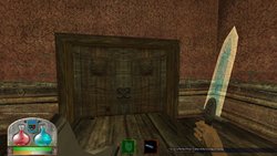
The left hand is the currently active hand, as denoted by the green highlight, similar to selecting items in inventory.
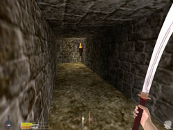
Here is an image for reference to the original hud. I know the highlight is red here but I think green makes a lot more sense.
There could be a variable similar to ms_invtype(maybe called ms_hudtype?) to switch between the large sprites, small, or none at all. I'm sure there must be other players who have at least thought of this idea before?

The left hand is the currently active hand, as denoted by the green highlight, similar to selecting items in inventory.

Here is an image for reference to the original hud. I know the highlight is red here but I think green makes a lot more sense.
There could be a variable similar to ms_invtype(maybe called ms_hudtype?) to switch between the large sprites, small, or none at all. I'm sure there must be other players who have at least thought of this idea before?

