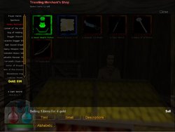
After reading The Man in Black's latest very inventory-centric dev diary I figured it wouldn't hurt to suggest this in addition to what hes already done. The inventory always felt a bit cramped with large icons (which I personally find to be the easiest to use) and I think it would nice to have it extended farther to the right edge of the screen. If possible maybe it could be so players could customize the size of their inventory screen with variables? I always wanted the inventory to be taller too so I wouldn't have to fiddle with that scroll bar on the left side where it displays your equipped items, too.
You are using an out of date browser. It may not display this or other websites correctly.
You should upgrade or use an alternative browser.
You should upgrade or use an alternative browser.
Increased inventory UI size.
- Thread starter Kanta
- Start date
- Admin
- #2
I use the small icons in list mode myself, specially now that we have alphabetical sorting. Mousewheel should scroll inventory (think that's true even in the last release). Not saying it can't/shouldn't be done though.
- Thread starter
- #3
- Admin
- #4
- Joined
- Jul 9, 2006
- Messages
- 6,904
- Reaction score
- 71
I think it would nice to have it extended farther to the right edge of the screen.
Will do
If possible maybe it could be so players could customize the size of their inventory screen with variables?
Eh, could maybe do this a little bit, but there are so many very many constants involved that adding them all would, I think, be way too overwhelming to someone trying to fiddle with it.
I always wanted the inventory to be taller too so I wouldn't have to fiddle with that scroll bar on the left side where it displays your equipped items, too.
Will do
Is it possible to make the small equipment window scrollable while your mouse is hovered over?
I think so. Components have detection for when mouse has entered/exited bounds, but each of the gear buttons is on top of the gear panel, and I'm not sure offhand if the gear panel will say the mouse exited if it moves onto one of the buttons. At the very least, think I could hack it to do a manual check on mouse location when the scroll wheel moves and just check the bounding box myself.
- Admin
- #5
- Joined
- Jul 9, 2006
- Messages
- 6,904
- Reaction score
- 71
Been pretty busy the past few days, but here's the changes I have thusfar:
Increased width
Centered, because it's always annoyed by that the gear panel is touching the left side but the contents are off the right.
Moved up as far as I can (without adjusting the size of the shop label)
Fixed "Selling X items for Y gold" overlapping buttons (forgot it existed the first time I wrote inventory buttons)
Decreased the empty space between gear buttons to allow more to appear before scroll appears. Hopefully, the majority of players won't even see the scroll bar
Scroll wheel moves the gear panel scroll bar when mouse is over the panel
Anyone else have issues they want addressed?

- Thread starter
- #6
- Thread starter
- #7
Actually come to think of it, it looks like the buttons for changing your inventory type could obstruct the new style of held item display option(the inventory sprites on the hud). I have no idea if it actually will or not but I'm just guessing that from your screenshot it might look a bit OCD inducing if those buttons were to overlap with your held items display.Anyone else have issues they want addressed?
- Admin
- #8
- Joined
- Jul 9, 2006
- Messages
- 6,904
- Reaction score
- 71
Probably yeah, in the same way it overlaps health/mana, but the item sprites are in the "background". I mean, I could add something to hide those sprites if there's a store/inventory menu open, but I'm not sure it ends up being a big deal
- Thread starter
- #9
